Consistent web design, writing of web content (redux)
 I know its bordering on passé to write blog posts criticizing people and businesses for their shortcomings, but I feel it necessary to present another example of what I discussed over a week ago. In that post I discussed how brand confusion can be created by a company that’s sloppy with its online content. I stated that web designs and written web content that are clearly and consistently created could potentially translate into increased sales. I also posted a few examples of sites that lacked consistency and clarity.
Yesterday I found another example of inconsistency in branding, which reminded me to talk about an underutilized editing tip.
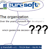
Check out this page from an Italian informatics company: http://www.eusoft.it/en/company
- The title image at the top has the company name stated as “eurosoft.”
- The text has the company name as both “Eurosoft” and “EuroSoft.”
- The contact information at the bottom states the company as “Eurosoft.”
This is the name of a company, something that you would imagine would be treated consistently well in the public eye. Instead the company has three variations of its name on one page. I have no idea how to formally document the name of this company for my current project without communicating with someone at the company. I shouldn’t have to do that.
And now on to that editing tip I mentioned. If I were in this company and were calling the shots, I’d have had the material edited pre-live, in a web-ready format. This editing step gets overlooked frequently. Typically a body of text (if edited at all) will be sent for editing as a text document. Revisions to that document then will be pasted into a web page and called done. But one of my golden editing tips for web content is (if possible) to perform a final edit in the environment it will finally be posted to.
The easiest example of this is a blog post or article being posted through a content management system (CMS). There’s frequently a preview opportunity in a CMS, allowing the writer to see what the content will look like in its intended environment. Editing in this intended environment provides a fresh perspective on the text, often resulting in the observation of errors or inconsistencies that were missed while editing the original text document.
In the particular case of eurosoft/Eurosoft/EuroSoft, I imagine that someone may have edited the web copy in a text document format and then passed it off to the web developer. Sure, the text consistently uses “Eurosoft,” but once placed in its intended environment, things go awry quickly. Had a final edit been performed within the intended environment, I would like to believe someone would have pointed out the inconsistencies in the name throughout the entire page.
As I said at the beginning, I don’t necessarily relish in picking apart a person or business, but this seems like a strong example of brand confusion that could have been avoided by an on-page, “intended environment” edit. Of course there are other things that could have been done to prevent this. Perhaps a simple policy update by upper management regarding how the company name should be used in all correspondence would have also prevented this inconsistency. But then again, I’ve never been that qualified to talk corporate policy.
(Also, there’s an additional inconsistency with the actual domain name used: eusoft.it. However, I speculate they chose to use this domain name because a very similar company exists [or existed; it seems to have been acquired] at http://www.eurosoft.com/ called Euro Soft. [This company suffers a similar situation: instances of “Euro Soft,” “eurosoft,” and “EUROSOFT” make me scratch my head.] It’s also an Italian company. I haven’t been able to determine if there’s a connection between the two entities.)
Update: It’s October 6, 2011, and I updated the link to eurosoft/Eurosoft/EuroSoft. It originally pointed to http://www.eusoft.it/company, but it has since been changed by the company. Note, however, that despite this opportunity to correct their branding with the updated page, the new page is just as bad. Again, I see all three variations of the company name on one page. Additionally, the old page had the company name at the bottom as “EuroSoft,” but the new page now has it as “Eurosoft.” This is simply inexcusable.
Leave a Reply